ivar dc
Portfolio

Work that hit the target.

A body of finished work across FMCG packaging, brand identity, advertising and out-of-home. Open a case study to see a project from brief to rollout, or browse the full grid below.

Selected case studies7 featured

Keeping one of the UK's best-loved rice brands unmistakable, from the pack, to the fixture, to a campaign across the London Underground.

01 · Brief

One brand, every touchpoint

Veetee needed a single, confident look that carried from the shelf edge to national retail, trade exhibitions and out-of-home. The task was instant recognition, wherever the brand turned up.

02 · Packaging

Appetite on the front of pack

The boil-in-bag and everyday ranges were given clear, structured front-of-pack design: variant colour-coding, a strong logo lock-up and cues that read in a single glance.

03 · Exhibition & beyond

Turning the range into a stand

For trade shows the brand became an environment, and the look scaled up into an out-of-home campaign across the London Underground, taking the range from the shelf to the commute.

Jars, sachets, a barista range and foodservice, every format made to feel unmistakably part of the same premium tea family.

01 · Brief

A tea brand with range

Royal Chai spans instant tea, CTC, sachets, barista lattes and foodservice. Every format had to read as part of the same premium family.

02 · Core packaging

The jars set the tone

The Fresh Brew and Goodleaf CTC jars established the language: rich, considered and shelf-ready.

03 · Barista range

Chai, elevated

The Barista Chai Latte collection took the brand into café territory with warmer, lifestyle-led art direction.

04 · Launch

Karak, introduced

The Karak Chai sachet range launched with its own considered look, sitting naturally beside the wider chai line-up.

05 · Foodservice

Beyond the shelf

The brand carried into foodservice with a self-serve tea dispenser designed for premium hospitality settings.

Launching a range of authentic African sauces into national retail, with a campaign to match.

01 · Brief

Authentic, and ready for the aisle

D-One needed packaging and advertising that stayed true to its roots and felt confident enough for a national listing.

02 · Range

A range that reads at speed

Colour-coded heat levels and a strong, characterful front-of-pack make the range easy to shop, ready for a national Tesco listing.

03 · Campaign

Real flavour, real taste

The launch advertising put the food first, landing the range with genuine appetite appeal.

Giving a spice and pulse range the weight of an heirloom: a grandmother's kitchen dressed in the navy and gold of a royal house, built to sell from a modern shelf.

01 · Brief

The taste of home

Daadi's Rasoi means grandmother's kitchen, and the range is built on recipes traced back to 1936. The job was to make that heritage legible in two seconds on shelf, so shoppers reach for the jar their family would have used rather than the cheapest bag on the fixture.

02 · The palette

Royal by association

Navy and gold are the colours of royal houses, of crests and coins and heirlooms. Putting them on a spice pack borrows that authority instantly: this is a name with a lineage, not another own-label. The crest, the 'B.1936' date stamp and the ornate frame all pull in the same direction, so a bag of lentils carries the weight of something handed down.

03 · The range

One system, every SKU

A single pillow-pack system carries the crest above a diamond window onto the product, so the food does the selling while the frame does the reassuring. It scales across the whole spice and pulse line without a redraw, and the photography keeps the same low, warm, candlelit register.

04 · Range extension

Beyond the spice rack

The same system stretches comfortably into tinned goods and store-cupboard staples, so the brand can grow without losing its family look.

One premium Indian food brand stretched across frozen dessert, chilled street food and boxed gifting, each pack earning its place without breaking the family look.

01 · Brief

A name across three aisles

Royal sells in very different places: the freezer, the chiller and the gifting shelf. Each needs its own cue to sell, while still reading as one brand the moment you spot the crown.

02 · Sweets

Traditional, made to look it

The barfi and jalebi ranges lean on rich, saturated colour and appetite-led photography, framed so the sweet itself is the hero on a busy Asian food fixture.

03 · Street food

Chaat, with the energy intact

For the chilled street-food line the art direction gets louder: bold type, movement and a hand-drawn feel that carries the noise of a street stall onto a supermarket shelf.

04 · Gifting

Navy, gold and a reason to give

The gift range moves the brand upmarket with structural packaging in navy and gold, patterned and foiled so it reads as a present rather than groceries.

A full heraldic identity for a Rutland Water hotel and spa: crest, wordmark and stationery, built to sit comfortably on a flag, a business card and a four-star front door.

01 · Brief

An estate hotel needs an estate mark

Rutland Hall sits on the shore of Rutland Water as a country house hotel and spa. A generic hospitality logo would have undersold it, so the brief called for something with the feel of an inherited coat of arms.

02 · The crest

Peacocks, a crown and the lake

The crest is drawn as full heraldry: two peacocks as supporters, a crown above the shield, and inside it a sun rising over water with a lotus on the surface, a direct nod to the lake the hotel looks out on. A banner carries the name beneath.

03 · Stationery

Down to the business card

The identity was rolled out across stationery and collateral, the crest paired with a light, airy layout so it reads as refined rather than heavy.

04 · In place

Living on site

In use the mark works across the estate, from the flag on the driveway to guest-facing touchpoints in the suites, the terrace and the dining rooms.

Exhibition design for ADN International: a full trade-show stand designed, built and dressed to put a portfolio of brands in front of buyers.

01 · Brief

An empty shell and a deadline

Trade shows start with bare walls. The job was to turn an empty stand space into an environment that pulls buyers in from across the hall and gives every product room to sell.

02 · Design

Big graphics, clear hierarchy

Every graphic on the stand, the full-height panels, the counter and the environmental artwork, was designed here. Only the pack artwork itself pre-dated the project; everything you see built around it is ours.

03 · Build

From drawing to floor

The stand was produced and installed on site, from panel print and lighting to the counter build and product merchandising.

04 · Live

Open for business

On show days the stand reads clearly from a distance and holds together up close, giving the sales team a space that does half the talking.

The wider portfolio

Every shelf, every format.

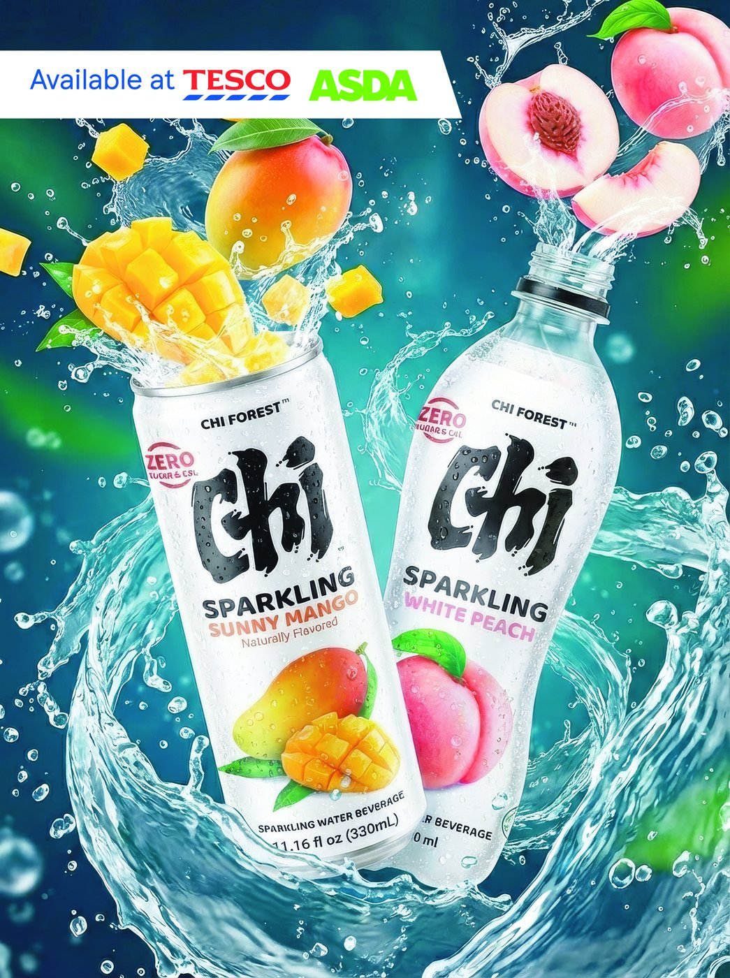
Chi Forest, Sparkling Editorial
Advertising

Chi Forest

Sparkling Editorial

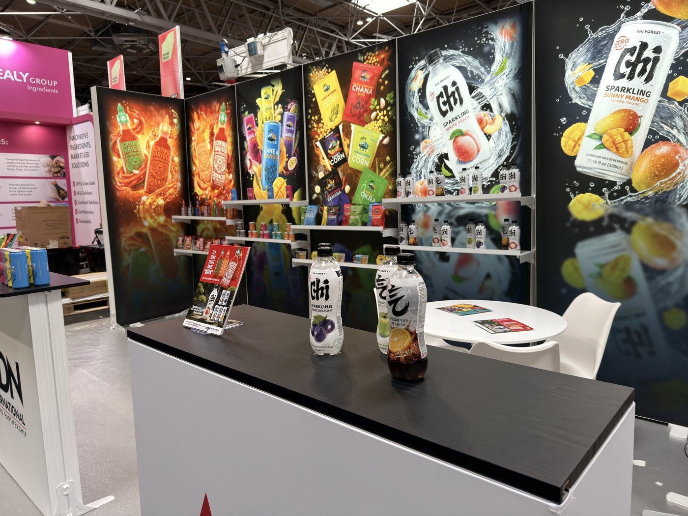
Chi Forest, Exhibition Stand
Advertising

Chi Forest

Exhibition Stand

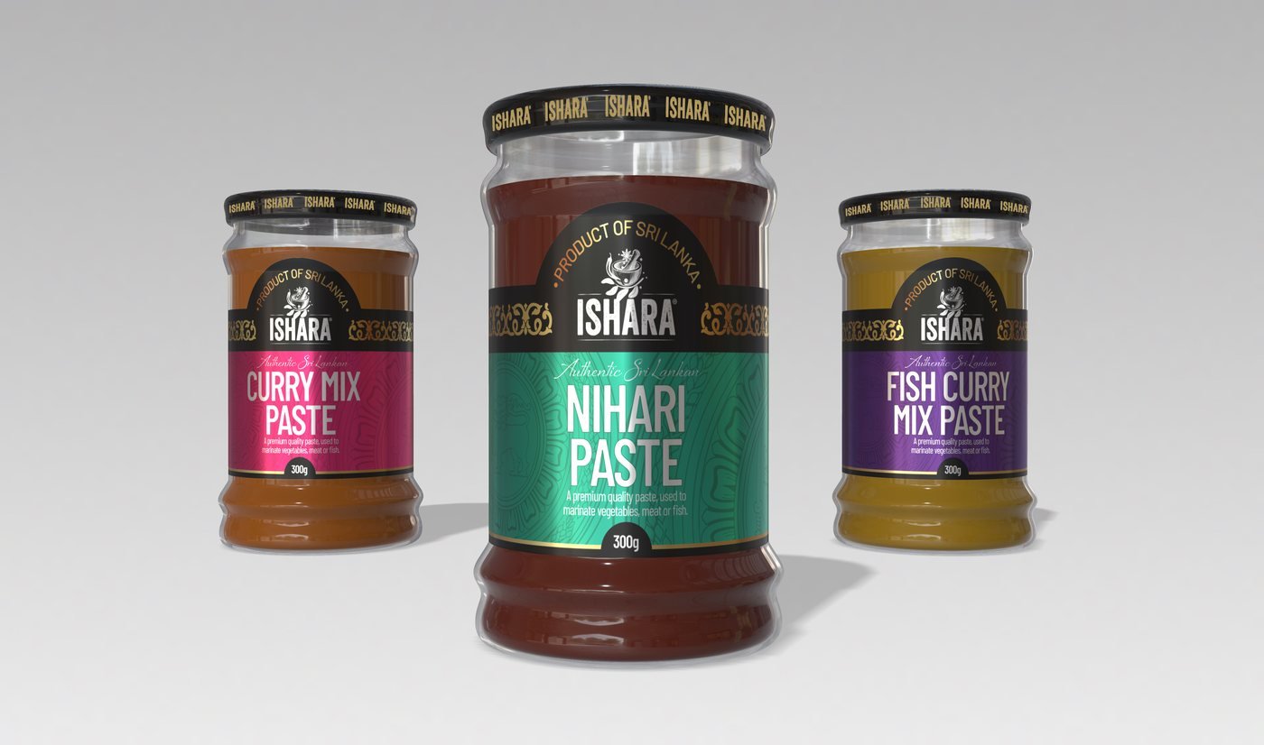
Ishara, Curry Paste Range
Packaging

Ishara

Curry Paste Range

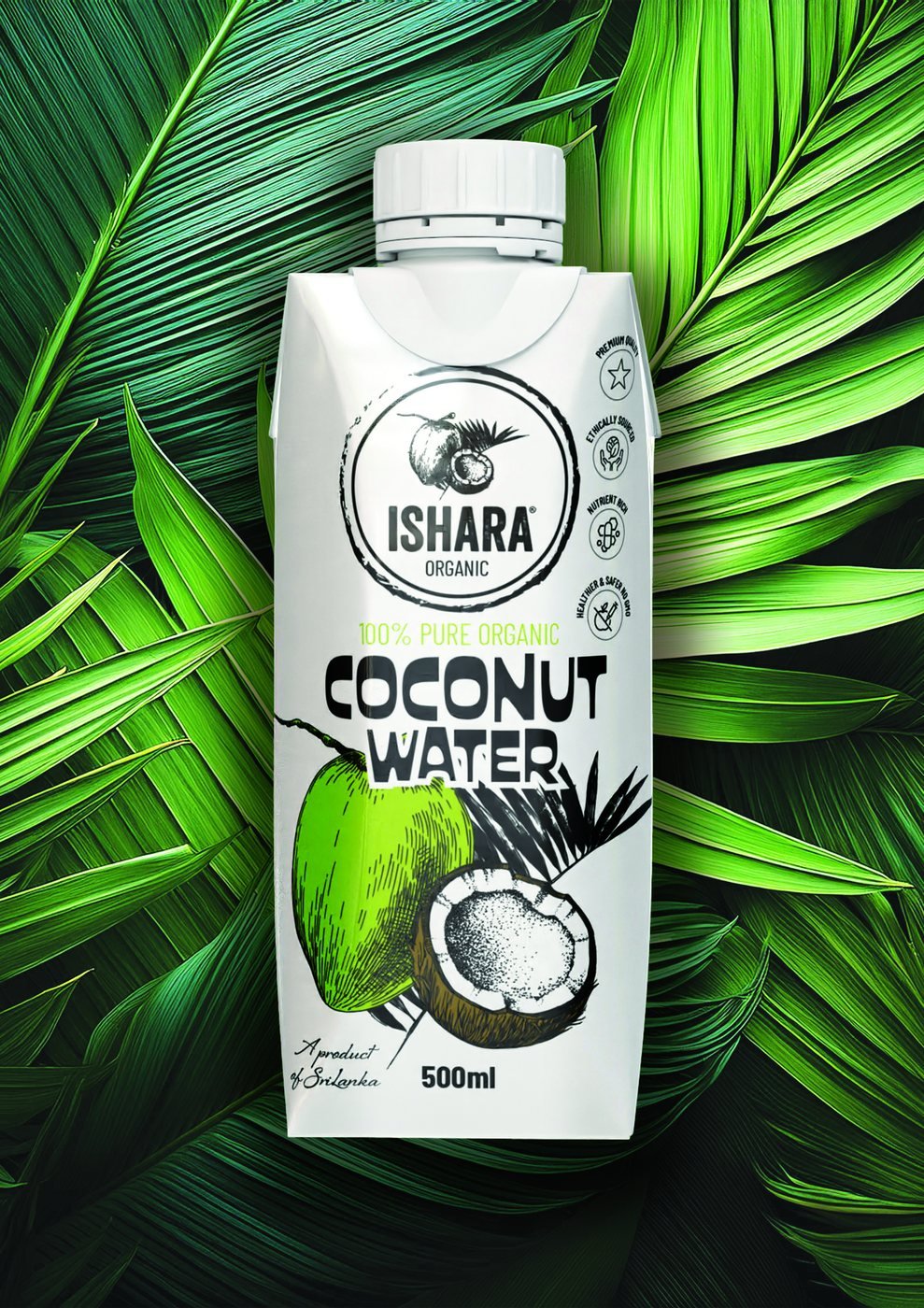
Ishara, Organic Coconut Water
Packaging

Ishara

Organic Coconut Water

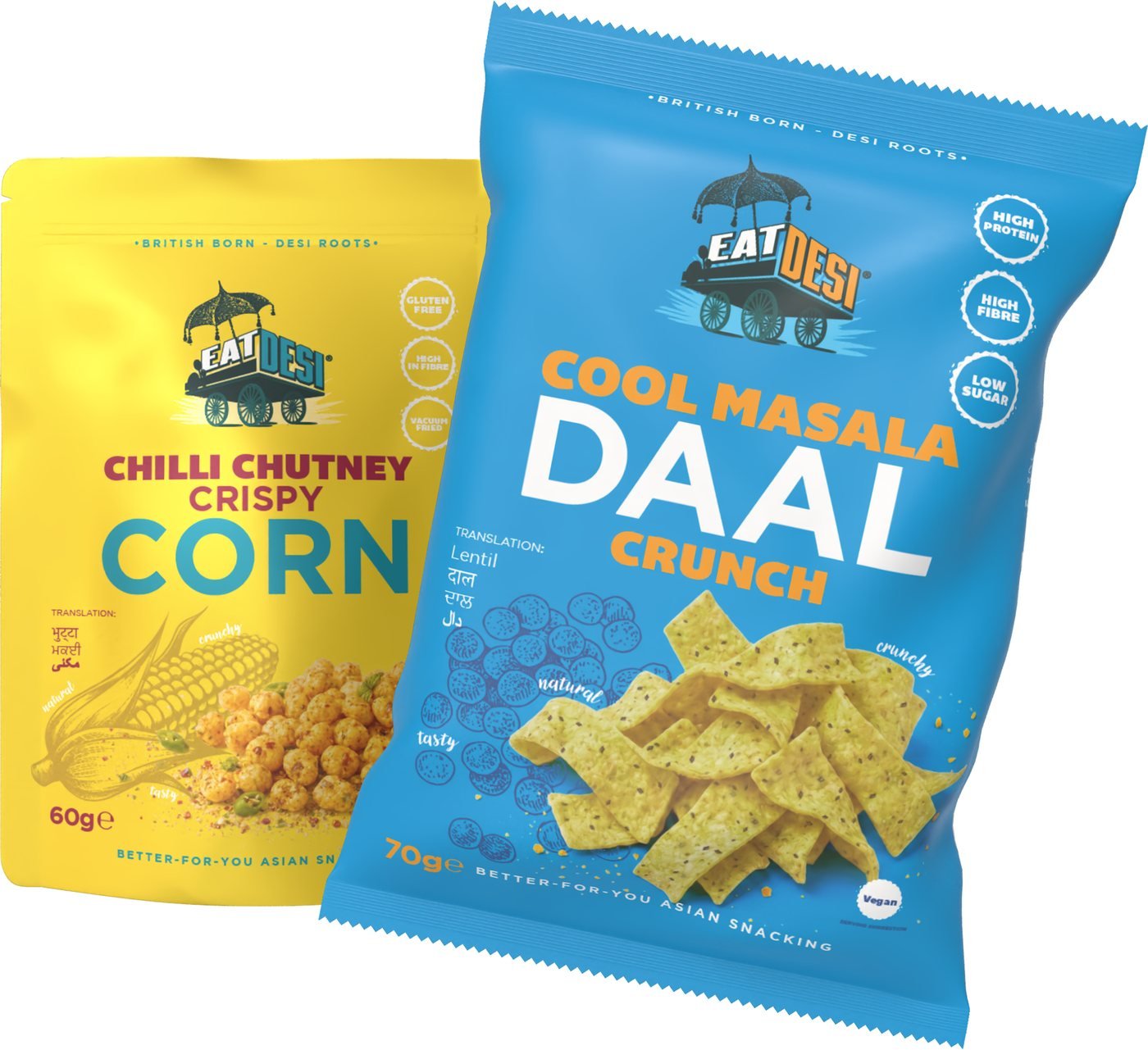
Eat Desi, Crispy Snack Range
Packaging

Eat Desi

Crispy Snack Range

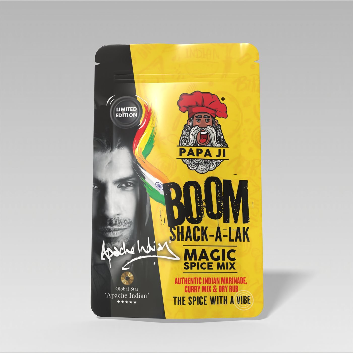
Papa Ji, Boom Shack-A-Lak Spice Mix
Packaging

Papa Ji

Boom Shack-A-Lak Spice Mix

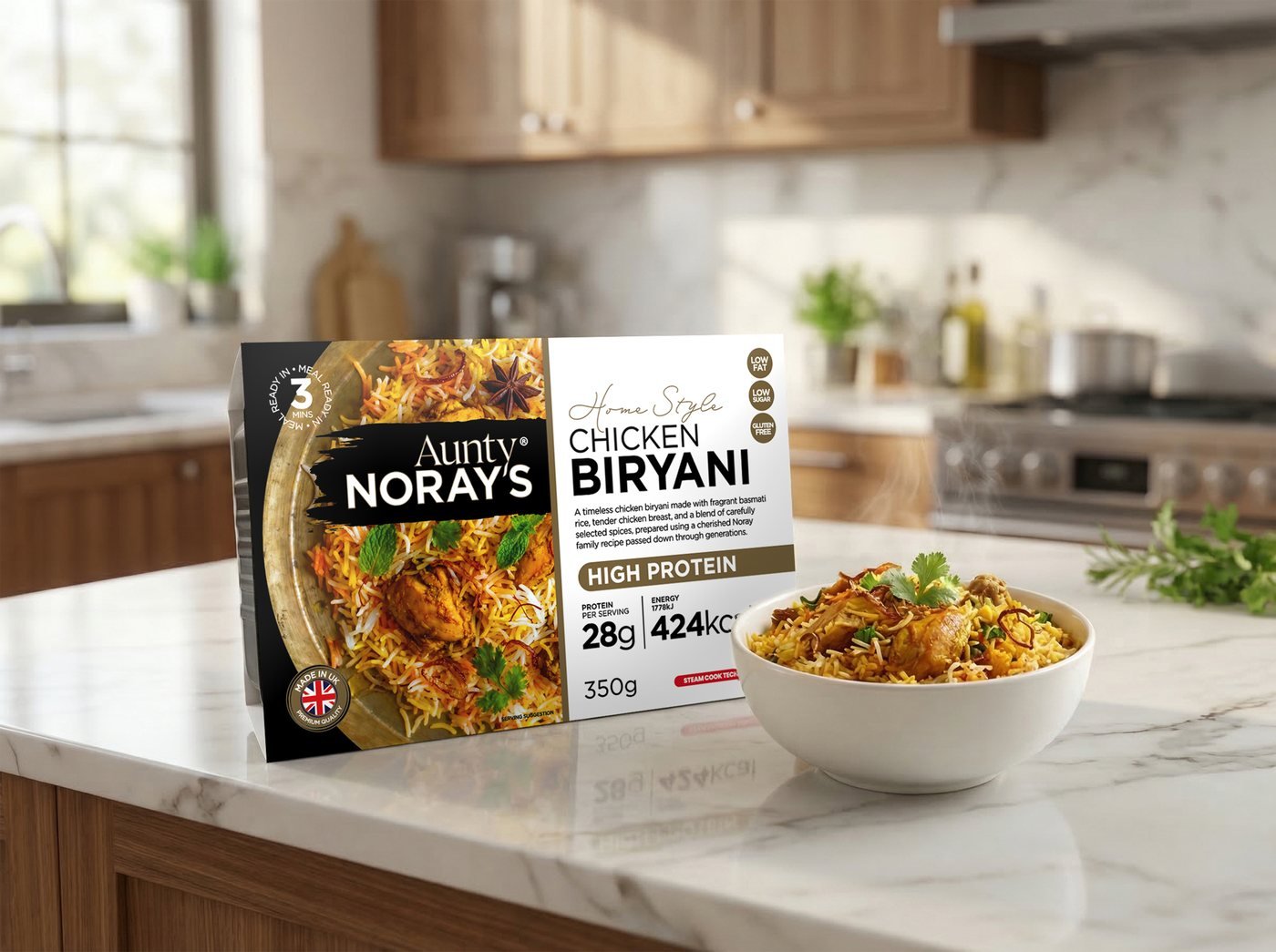
Aunty Noray's, Chicken Biryani Ready Meal
Packaging

Aunty Noray's

Chicken Biryani Ready Meal
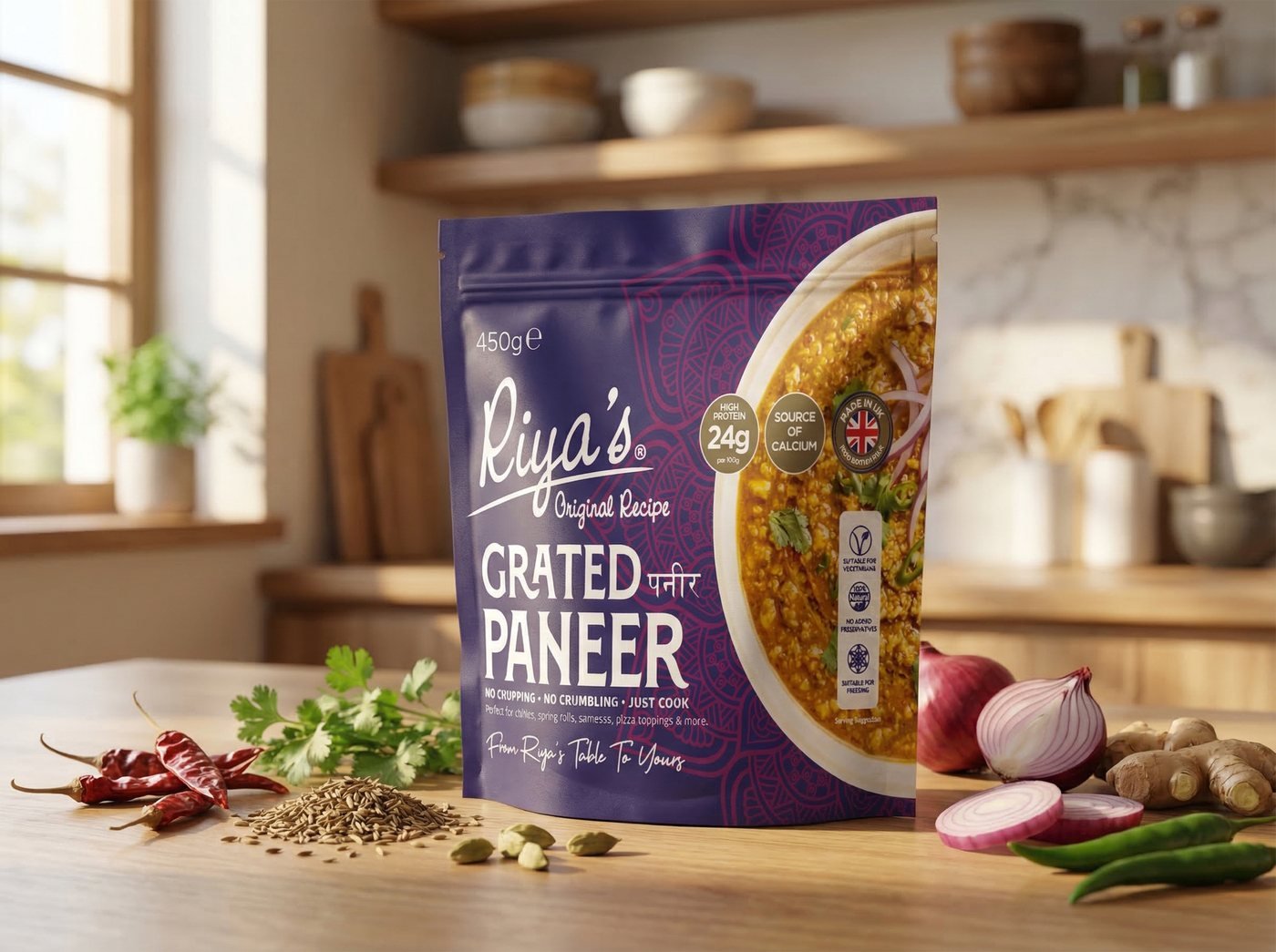
Riya's, Grated Paneer
Packaging

Riya's

Grated Paneer

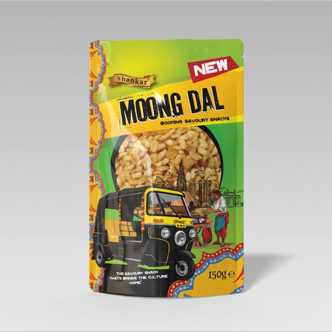
Shankar, Moong Dal Snacks
Packaging

Shankar

Moong Dal Snacks

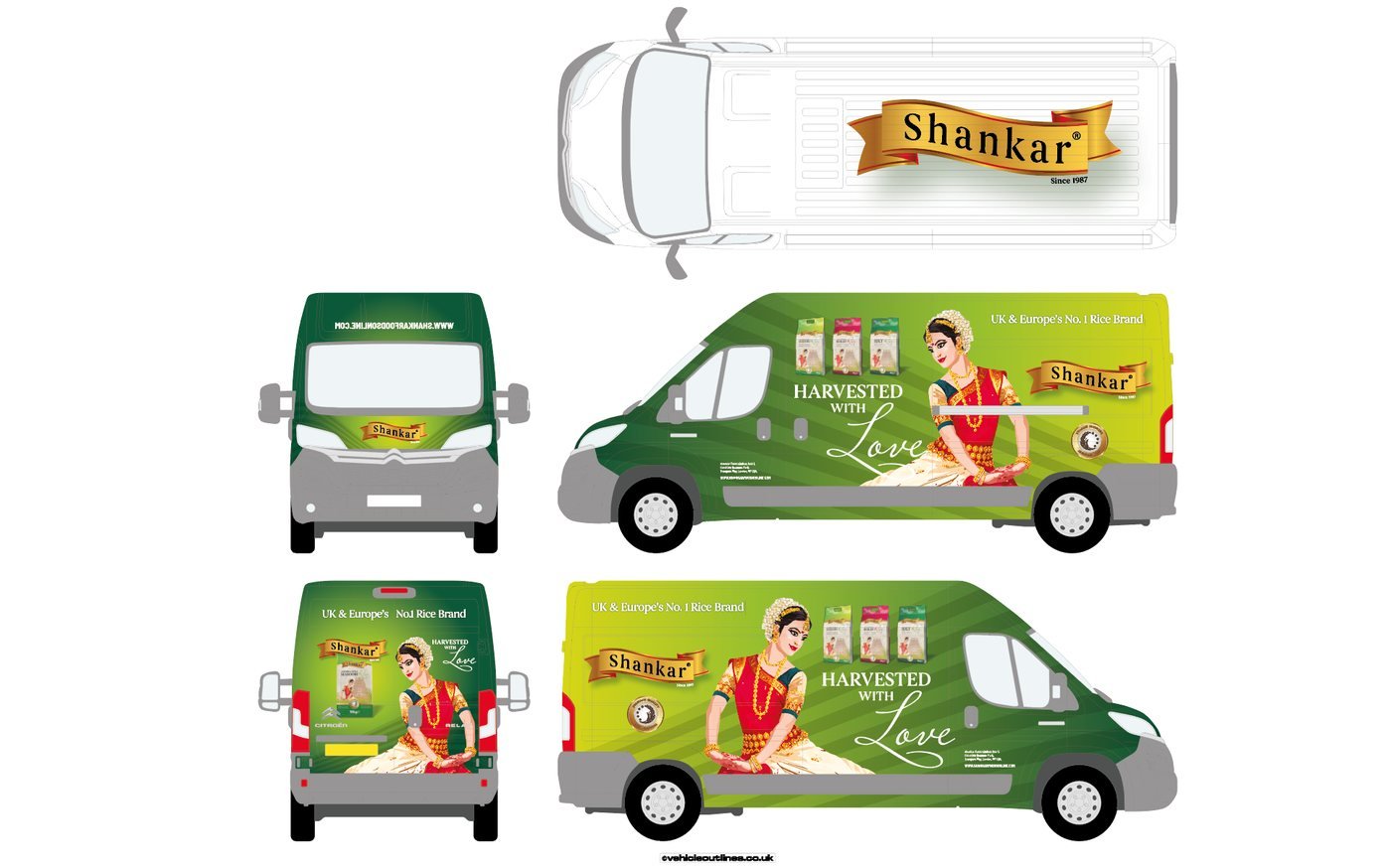
Shankar, Fleet Livery
Branding

Shankar

Fleet Livery

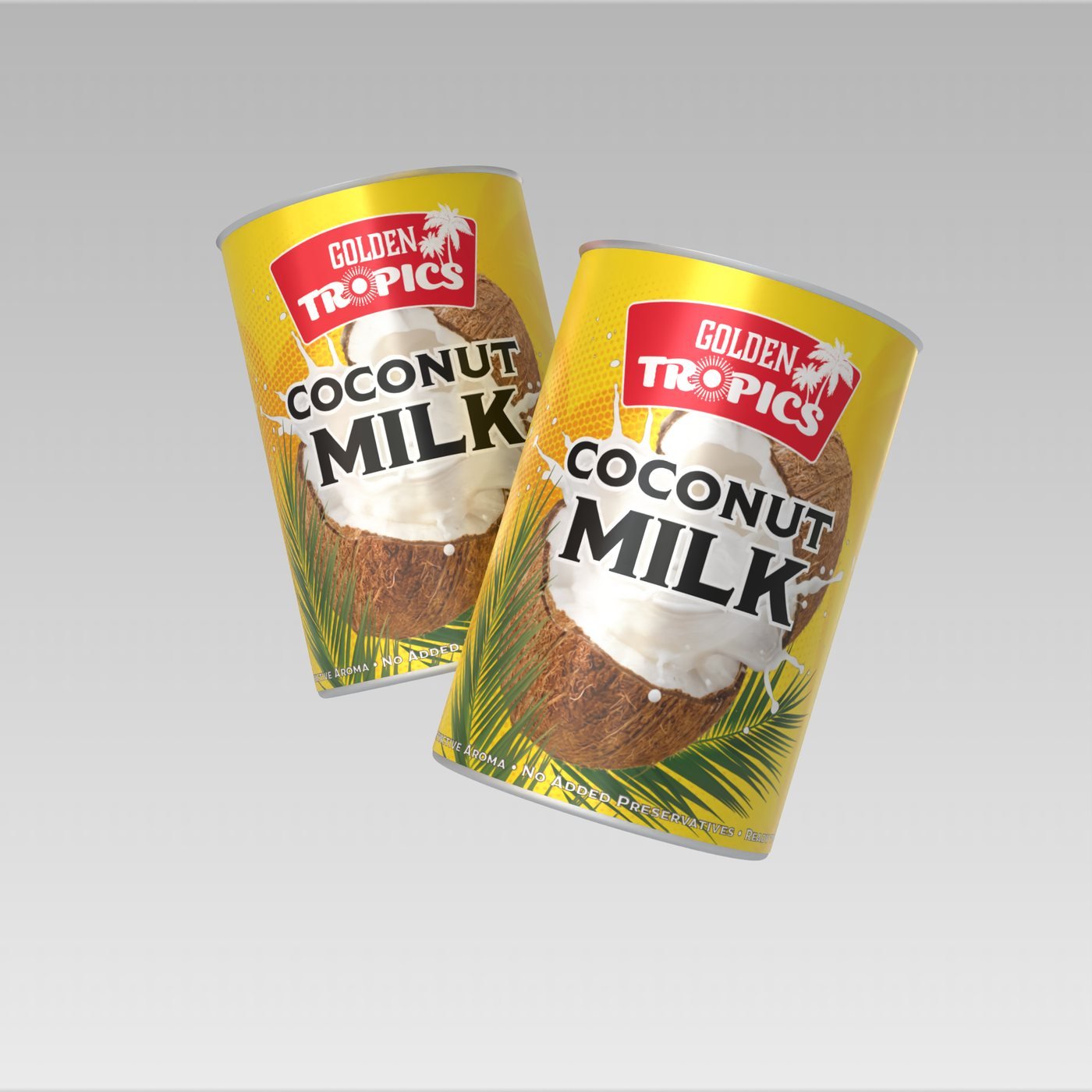
Golden Tropics, Coconut Milk
Packaging

Golden Tropics

Coconut Milk

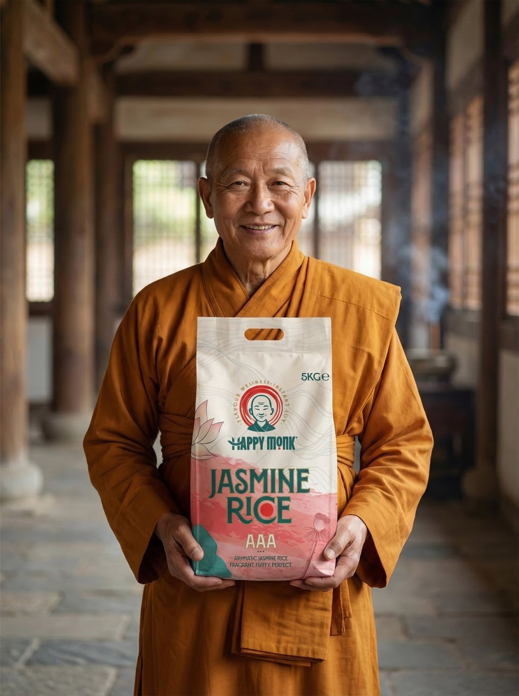
Happy Monk, Jasmine Rice
Packaging

Happy Monk

Jasmine Rice

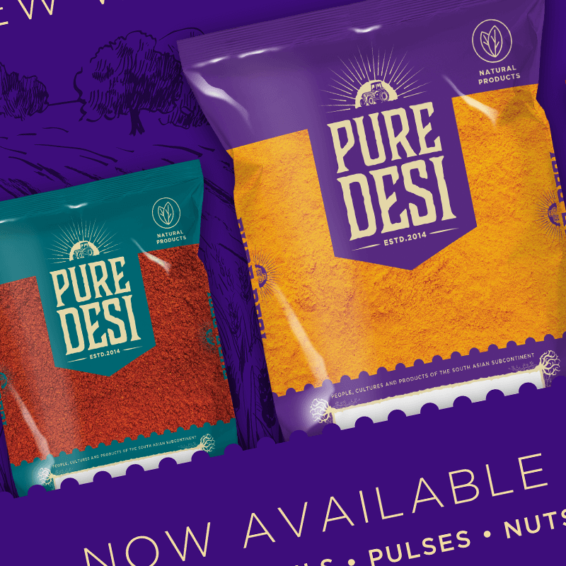
Pure Desi, Spice & Pulses Range
Packaging

Pure Desi

Spice & Pulses Range

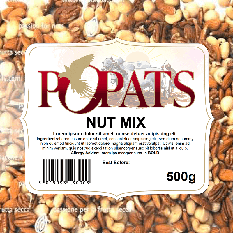
Popats, Nut Mix
Packaging

Popats

Nut Mix

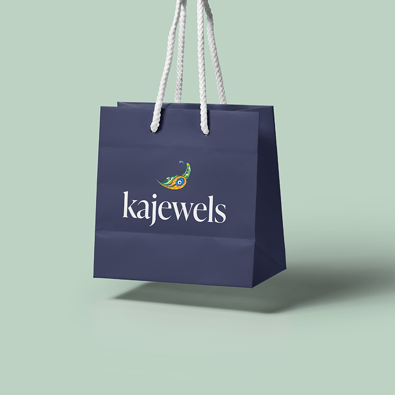
Kajewels, Retail Packaging
Branding

Kajewels

Retail Packaging

Smart Ops, Brand Identity
Branding

Smart Ops

Brand Identity

PV, Personal Training
Branding

PV

Personal Training

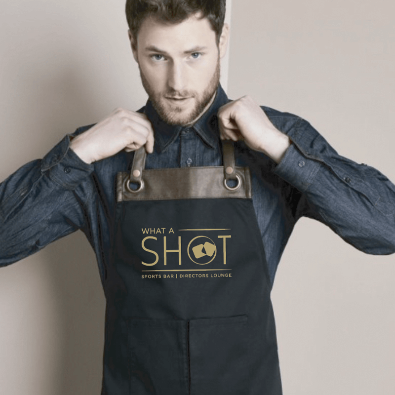
What a Shot, Sports Bar Identity
Branding

What a Shot

Sports Bar Identity

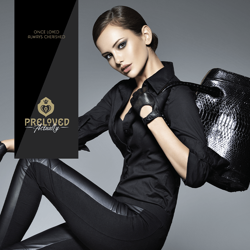
Preloved, Campaign Art Direction
Advertising

Preloved

Campaign Art Direction

Tiles marked “Case study” open the full story above. Everything shown is live, finished work.

Your target. Our aim.

Want to be the next one on the wall?

Bring us the brief. We'll take the shot.